Beam Portal Redesign

Project Overview
The project: To redesign Beam Collection Portal
Duration: August, 2021- February, 2022 (6 months)
My role: Senior UX designer
Product Introduction

The Portal
The Problem
The Problem
The Beam Collection Portal is a B2B data transmission platform designed to connect debt owners and debt collectors. It enables seamless, real-time updates whenever data changes, ensuring all parties stay informed. The system focuses on transparency and effortless activity tracking, enhances operational clarity across the debt collection process.
The Problem
The Problem
The Problem
Users of the old portal faced significant challenges due to its non–user-centric design. The interface was difficult to navigate, overly technical, and visually cluttered, which led to frequent frustration and errors. These usability issues not only increased the need for additional training and support but also resulted in inconsistent data recording, affecting the accuracy and efficiency.
The Goal
The Problem
The Goal
Redesign the Beam Collection Portal to transform it into a user-friendly, intuitive platform that supports the full workflow—from viewing and managing task lists to scheduling and accessing support. By addressing usability pain points in navigation, task handling, and communication, the redesign aims to reduce user errors, minimize training needs, and improve overall efficiency.
Design Process
Card Sorting
Conceptual Sketching
Conceptual Sketching

Led card sorting workshops with stakeholders to reorganize information structure to create an intuitive information architecture and navigation system.
Conceptual Sketching
Conceptual Sketching
Conceptual Sketching
An early stage sketch of the redesigned Task Editing page from a UX ideation workshop.
Low-fidelity Wireframing

A wireframe sketch of the redesigned Task List page, featuring a streamlined, list, including a color-coded activities inspired aligned with Airflow concepts.
High-fidelity Prototyping

High-fidelity prototype of the redesigned Task List page created in Figma.
Task List Page
Before
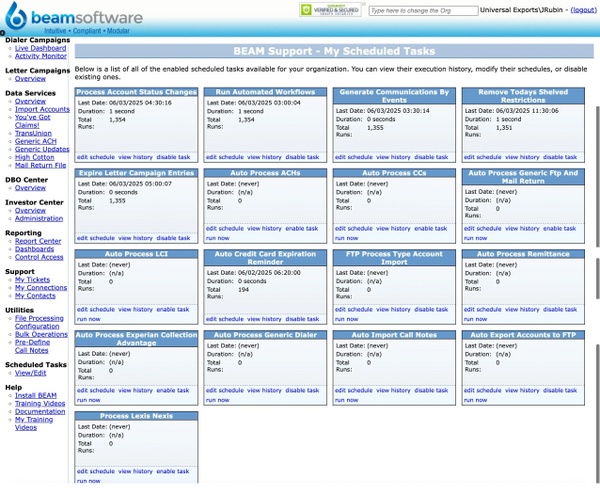
The original interface had a cramped left-hand menu and task cards scattered across the page, with no search functionality and inconsistent blue tones throughout. The layout made navigation difficult and lacked visual coherence.
After

The redesigned interface features a top navigation bar with hover-activated dropdown menus and a search bar conveniently placed in the upper-right corner. Task cards were replaced with a streamlined, sortable task list, including color-coded highlights for recent tasks to aid quick recognition. Action buttons for adding and downloading tasks were added for improved efficiency. The new layout offers a cleaner look and significantly enhances task navigation and management.
Task Editing Page
Before
.png/:/rs=w:600,cg:true,m)
The original task management page lacked task descriptions and detail visibility, making it difficult for users to understand task context. The scheduling interface was manually intensive, repetitive, and visually cluttered, increasing the likelihood of user errors during task creation or editing.
After

The redesigned page has the important information of the task on the left side, with input fields for easy editing. The scheduling interface on the right side utilizes toggle switches, scroll bars and calendar pickers to showcase a modern and intuitive design. Users can easily set up schedules for recurring or one-time tasks and save the changes.
Support Page
Before
.png/:/rs=w:600,cg:true,m)
The original support page offered only a single support option—submitting a ticket—with no ability to reopen closed cases. Users struggled to follow up on ongoing issues or reference past communications, leading to frustration. The interface felt outdated, overly technical, and lacked the user-friendly design needed for effective support interactions.
After

The redesigned support page offers multiple communication options—including live chat, email, and phone—giving users flexibility in how they seek help. It displays both open and closed threads, allows users to reactivate closed conversations, and provides easy access to past interactions through a clearly organized archive folder.